08 Apr

Offer a better 404 page for your visitors!
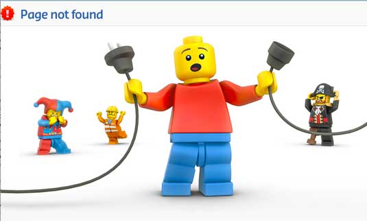
offer a better 404 page for your visitors

When an user click on a non-existent page or a changed page (page 404) this is really an unpleasant situation. Watch this page: http://www.galiacho.es/404. IT could happen if we have misinterpreted the name of the website, made a syntax error or simply by the fact the page is no longer available. It could really undermine the credibility of your website if the 404 page reflect only a white page like the one shown.

Most CMS like WordPress, should have in their themes a basic version of errors pages following Google’s recommendations in this regard, but this is not enough.

It is therefore of interest to offer a better 404 page for broken links, a little more attractive. And, why not go beyond the simple picture or comic creative design by giving useful functions? After all, the visitor was looking for something specific, which for one reason or another haven’t get!


1. Think mobile-friendly

Obiviously be sure that your page is “mobile friendly”. Any concept you are creating should show well on a mobile phone or tablet.


2. Take the opportunity to show your brand!

How to enforce your brand?  Maybe you can ask a web designer to play with your corporate logo and create an animation? Or just planning a short comedy video? Let’s look at KitKat’s solution : https://www.kitkat.com/404notfound. Is not it great ?!


3. Offer Useful Links

Do not forget to add or make more accessible the links of your website. A link to the site map, a top menu and a page that gives the feeling of not being on another website is important.


4. A search field

This is one of the most important aspects. Initially, the visitor was seeking something that he still searching! Offer a search field well presented in the center of the screen with proper typography. It is possible with a bit of knowledge to make a small routine and extract in the url address, the terms sought by your visitor.

Internet Cloud Canada recommends the use of Google Custom Search API. You can learn on this subject at : https://developers.google.com/custom-search/ or your web developer (or our web technicians) are able to install this service on your 404 page.

With a routine and the API of Google, you have on hand the opportunity to suggest to the visitor better choices, not just a search field. The user experience is greatly enhanced and the reputation of your brand too.


5. A kind word of apology

Sometimes just a nice little sentence mentioning that the page is not found make a difference. It can have a bit of humor also in that little attention to the visitor.


6. Translation of 404 page

If your site is multilingual, it’s better to offer 404 pages in all languages ​​of your site. This enhances the user experience on your site and your desire of personalization of the message.


7. Email Form

It would be wise to place a form for sending e-mail to you. Whether for visitors to learn more about what he searched or to display a message to inform about a broken link on your website. Many visitors are kind enough to do so.


8. Do not call the page “Error 404″

The 404 is the http return code, no need to call this page in the title or description “error 404″. Show rather a clear message to your visitor. Very often at the sight of an error page, the visitor does not know what is happening. Visitors can believe in lots of scenarios, so show precise informations on that page and explain the error cleary.


9. A page over 512kb

Internet Explorer still needs a 404 page with a weight of 512 kb and more otherwise it returns an error page in a preset format. These days, it should not be a problem, but it’s better to check that too.


Manage the 404 pages

The user part is completed, the work is still not complete. You should handle errors 404 with great concern. You will need to:

– Consult the exploration statistics in Google and Bing Webmaster Tools

– Ensure that the error page returns the correct error code 404.

– Fix broken links on your website

– Do not automatically redirect all broken links on the main page, this situation brings only confusion especially on the visitor’s side who will wonder why he reached it instead of what he sought.


All these actions will make a difference when a user will see your error page, and it will happen for sure!

Share this
07 Apr

WP Super Cache Security Risk – Plugin WordPress

WP Super Cache Security Risk - Plugin Wordpress

IMPORTANT ! - SECURITY RISK

All those using the popular WordPress Plugin Wp Super Cache cache, must immediately update to version 1.4.4.

An exploit allows injection of data in files, allowing a hacker to create additional administrators and use the wordpress tools to create malicious files.

This is a very popular plugin that can reach more than 1 million users worldwide.


Serious and Verified Risk.


UPDATE YOUR PLUGIN NOW!

wp super cache security risk

http://arstechnica.com/security/2015/04/as-many-as-1-million-sites-imperiled-by-dangerous-bug-in-wordpress-plugin/

All those using the popular WordPress Plugin Wp Super Cache cache, must immediately update to version 1.4.4.

An exploit allows injection of data in files, allowing a hacker to create additional administrators and use the wordpress tools to create malicious files.

This is a very popular plugin that can reach more than 1 million users worldwide.

wp super cache security risk

wp super cache security risk

wp super cache security risk

Share this
07 Apr

67% of Abandoned Cart on E-Commerce Websites

67% abandoned cart on ecommerce websites

You do not have a good conversion rate on visits/sells?

Whether or not you have a statistical tool to evaluate the losses in your online business, there’s more than 67% of visitors who leaves items in their shopping cart, without continuing the checkout process.

What causes this? Obviously, they are multiple reasons 

67% of Abandoned Cart on E-Commerce Websites


You must ask yourself : Is the current website adequately serves customers that we receive online? Is it possible to improve the user experience for a better marketing approach?

Most of the time when sales do not reflect our goals, but we have an excellent ratio of visitors, the answer is: YES.

We will not repeat the aspects we have previously described in our latest articles to have an inviting website, rather we will in this article, see how to lower the dropout rate of the basket before payment.


The main causes of abandoned cart (not in order of importance):

1. The client can not get a clear idea of ​​the final price and adds products to have the information.

2. The price with taxes and / or with the shipping costs are too high after revision.

3. The customer does not want to share his personal details or e-mail address, before proceeding to payment.

4. The delivery option does not please the client, and this information is not available before putting cart items into it.

5. the customer has no “wishlist” option, so it adds items to cart, then the price at checkout  (even if it is not the real one), is too high.

6. The customer will be redirected for payment on an external platform.

7. Loss of confidence versus the merchant along the way. Broken links, missing images, error of the platform, absent purchasing policies.

8. Refusal of the credit card at checkout.

9. Confusion or too difficult checkout process.

10. The customer wants to wait to have a better “deal”.

11. The process is too long.

12. The prices are presented in a currency other than the one of the customer.

13. The customer sees an option for a ‘Discount coupon’, but do not have one. He knows he can save but not this time.

14. The customer made the tour of the website, navigate or he is testing the website.

15. There are not enough payment options.


How to reduce cart abandonment rate?

You have to understand the main reasons and correct the website. Simplifying the payment process, showing the actual price and payment/delivery options is the first step. This step is the “Transparency” to offer to the customer. Also make sure you declare the purchase conditions, return policy or the privacy policy.

Then, make sure that the website complies with standards or have certifications or security seals. Customer confidence in buying relies heavily on protection of his confidential details.

If you adopt the school of thought that the customer must register before making a purchase, use a tool to make a recovery of the cart process. So send emails to encourage visitors to come back to you by offering a discount or benefit, if this settles with your vision.

Finally revise the website and your products or services. Images are sufficiently present, relevant and complete information? The website works properly on all devices?  Is there a problem with the payment option?

Dropouts are an important aspect of a successful e-commerce site. Ideally, you should know your dropout rates and take actions now, follow the advices of your web developer for a better future success.

Share this

© 2018-2023 Internet Cloud Canada.Tous droits réservés. (Sitemap).